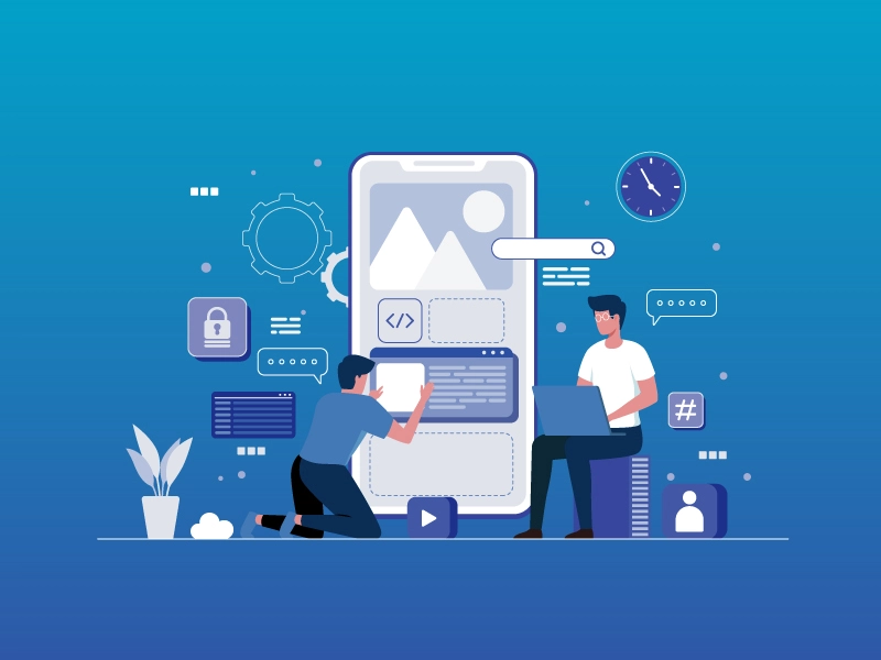
What are the SEO Advantages of Responsive Web Design
Nowadays, most of the internet usage is through smart mobile phones. They are easy to carry and easy to connect from anywhere and anytime. Many businesses consult a Web Design and Development Company in Chennai to ensure their websites perform well on all devices. To create your webpage to work on any screen size, you have to design a responsive web page so that it can be accessed on any screen size. Apart from helping in accessing your site from any type of device, this also supports SEO to be used optimally. We are discussing aspects such as click versus touch, screen resolution, flash player compatibility, and others. Let’s speak about a few SEO advantages you may receive when the design you create is responsive.
How a Web Design Company in Chennai Enhances SEO with Responsive Design
- Good Google Ranking
Google always has a preference for websites that come with a single design for every gadget. Google recommends that a website be created with a responsive design, and it gives special attention to those that display well in search results. So it automatically enhances SEO. Google’s rules and regulations are framed in such a way that they favor responsive website design, which is why many businesses rely on a Web Design Company in Chennai to ensure their websites meet these standards. User signals are analyzed by Google, and if people are turning away from your site because of compatibility problems, your search engine rank may significantly decrease.
- Single Website For All Devices
When you design two separate websites, one for desktop view and another for mobile view, there is a high probability of URL clashes, which can lead to content duplication issues. This essentially means your own website has duplicate content, which can result in a steep decline in rankings since Google doesn’t favor duplicate URLs. Responsive design eliminates this problem, making your site act as a unified unit and aiding in better URL management. This results in distinct URLs for your website, leading to a decrease in bounce rates and a significant increase in organic traffic.
- Reduced Bounce Rates
If a web user visits your site and it is responsive, they won’t have to struggle with zooming in/out for a clearer view. Responsive design ensures that your content adapts well to the device’s screen size, preventing discomfort for users. Multiple URLs can lead to slower loading times and crawling issues, potentially causing visitors to leave quickly, resulting in high bounce rates. High bounce rates negatively impact rankings since Google monitors user signals and responses.
- Improved Website Speed
A responsive web design often leads to quicker loading times. Multiple URLs can result in laggy and delayed loading, taking an average of around 7 seconds, which is quite long. However, a responsive design loads much faster, with Google expecting loading times to be within 1 second.
Conclusion
Hopefully, you now understand why creating a responsive web design is crucial for your website. Prepare to implement a responsive design to enhance your site’s performance in search engines. For further assistance in these aspects or to improve SEO, you can reach out to various SEO company in Chennai or other cities. These are the many benefits you gain by activating responsive design on your website. Since you’ve read about them, I’m confident you’ll be implementing it soon to help your website perform better on the internet and improve its SEO.